Showing posts with label Interfaces. Show all posts

Friday, January 19, 2018

Google Search and Coffee

Google search, via Google Maps, gives some bizarre results for "coffee", as you can see with these three result sets. (And now Blogger is being horrible with layout, yes, I know, Medium or something, but I started this blog a long time ago, switching costs.)

Here the search is just "coffee", so, obviously looking for somewhere to get coffee (perhaps in liquid form). You see Starbucks, which I am not a fan of, and at this zoom level there is one other name that is showing and a few results where the name of the location isn't shown.

I want something without Starbucks (which is the next search), but also note there is nothing showing in the triangle made by those roads there in the middle/left.

So, the same search, with "-starbucks" which should, I have been told, exclude Starbucks. Except it didn't do that -- it removed all results but one. Although I hadn't zoomed in on that previous search, I can tell you that not all the results were Starbucks. We know at least one result, on the left, was for "Pavement Coffeehouse", which is not a Starbucks. This search result is completely incorrect and thus rather useless. Notice there are still no results in the triangle space there in the middle/left.
So maybe you were wondering, "This is Boston, where are the Dunkin' Donuts!" Good question. Google wasn't showing them, despite Google's description of DD: "Chain known for donuts & coffee". So, right there, AND COFFEE. Yet DD is not a Google Maps result for "coffee", as shown above. (Although the pin shows a fork and knife, not a cup and saucer.)


So, what is going on?

  1. Google appears to have not associated "coffee" with Dunkin' Donuts, which is wrong.
  2. Google seems to think that "-starbucks" means "get rid of all results for things Google thinks are like starbucks", which is also just wrong.
In conclusion, you can't use Google Maps to search accurately for coffee.

Wednesday, October 4, 2017

Minitel!

A working Minitel! This one was built in 1985 and is still going strong, cared for by Julien Mailland and Kevin Driscoll, who spoke recently at MIT's Comparative Media Studies program weekly seminar. They have an awesome new book out about the Minitel that hit on many of the issues I also ran into studying related technologies in my dissertation back in ~2003.

But, as they told me, all the specs for the Minitel were released when it came out in the 1980s so all the service providers could connect to it. Those specs are still available today, so they have a working Minitel and an Arduino device sending it some data. Wow! Super cool.

Minitel, front
Minitel, back, and Arduino device

Closeup, Arduino device

Thursday, April 14, 2016

For A Decent CSV Spreadsheet App

All I want is a decent spreadsheet app that does not insist on mangling my CSV files, which often have ID numbers in them which I might want to view as text and not numbers. Apple's Numbers is maddening (you have to export to CSV, extra steps, and it has a relatively low row limit, 65,535 I believe) and Microsoft's Excel is a little better but I'll use it as an example here of What You See Is Not What You Get.

I am doing some work on cities and (county-level) FIPS codes (so, in the US, FIPS codes are Federal level identifiers useful for a lot of things, they identify counties). Some cities are large and lie in more than one county. Some of the data I have deals with cities, and the income data is on the county level, so I need to map from cities to county FIPS.

Excel did not make this easy.

The file I grabbed off the net to help me map cities to FIPS (counties) quite correctly listed all the appropriate FIPS codes for each city. I needed to narrow this down to one (Wikipedia helped a lot, the geopolitical Wikipedians are nitpickers).

FIPS codes for counties have two parts, two leading digits for the state and then three digits for the county. So all FIPS codes that start with 36, for instance, are counties in New York state.

The format from my source file looked like this:

Raleigh, NC:    37063,183
Birmingham, AL: 01073,117
New York, NY:   36005,047,061,081,085

(I am pretty sure those 5 numbers for NYC are the 5 boroughs, I know Brooklyn is its own county, Kings county.)

Excel, however, would show the following in the main view, interpreting these IDs as numbers--errors are in the parentheses, A, B, and C:
Raleigh, NC:    37,063,183 (A)
Birmingham, AL: 1,073,117 (A,B)
New York, NY:   36,005,047,061,081,000 (A,C)

Errors:
  1. Added a comma that isn't there.
  2. Dropped leading zero.
  3. Rounded rightside digits.
So there are at least three issues there, but the most difficult one is that it put a comma in after the two digits for the state, initially making me think that indeed the source file had a comma after the state component of the FIPS code. It did not. Parsing the file did not work.

That was all extremely infuriating, and reminded me of Microsoft's Clippy, where the coders thought they always knew better than you. Granted, a lot of apps and even programming language packages try to be smart and guess formats, and yes this can be useful. But if there are leading zeros and commas in odd places (or not) and it's a CSV (text) file, there could be a default "read CSV as text". Of course it seems that neither of these two programs have been coded to play nice with CSV files.

As such, they are not overly useful data science tools.

Monday, March 14, 2016

Plagued By Bad Design, Still

Design, from websites to cities to forks, is so important, all around us, and so easy to get right--but also easy to get wrong in some cases. Here's one that was easy to get right, but the designers and people who approved it still got it wrong (don't they even test these things?).

The NYC MTA information/help audio posts found in many subway stations have two words, and two buttons, as you can almost see in the first photo. Except that the second button is really hard to see (although this photo unintentionally made it worse than usual, but it's still pretty bad).

Actual info post thing.

There are two overall problems, which you can see a little in the below photo.

  1. The physical placement of the words in relation to the buttons. 
  2. The color of the buttons. 
At first glance it looks like there is one Emergency Information button. But there is a second, dark, button there. But the word Information is closest, out of both words, to the red button, and the red button is closest to the word Information. So the red button and the word Information must have some relationship.

They don't.

Notice the yellow lines are longer than the blue line.


Clearly, the Information button should be easier to see, and the two words and their actual buttons should be visually obviously related, that is, by distance (although you could also do color). One solution would look like this:
Much better!
I don't even have a degree in design. This isn't rocket science.

Tuesday, October 27, 2015

Blue Background, White Text

Microsoft Word used to have a fantastic option, making the background blue (instead of white) and the text white (instead of black). I and many people liked the change of contrast. I first remember falling in love with this feature in the much-loved Word 5.1 a long, long time ago (circa 1992).

I use it on my home machine with Word 2011. But with my new laptop, Word 2011 was not an option, I had to use Word 2016, which I rather like so far (despite initially causing massive problems for my citation management software). And, the option for blue background, white text is gone. And that's disappointing and problematic.

Having most of the screen be white (the background) makes the screen very bright. It's like staring into a light, albeit a dim one. You want to keep the contrast between the text and the background, but you don't need black on white to do that. A lot of interfaces do that and I think it is stupid. Even this Blogger editor is doing that (but notice what I've chosen for my blog layout). This is a blog, it isn't ink on paper, it's way beyond that.

Which is another part of the issue: the paradigm. This is a computer, it's not ink on paper, which is a whole other technology. Yes, writing papers on the computer stems from typing in black ink on white paper on a typewriter, but this isn't a typewriter. You can change the writing in your document to two columns, add images, add footnotes, move anything anywhere, add page numbers, make sections, change something to italics after you write it, have hyperlinks.... You know. Computer word processing is based on typing on a typewriter, but it is light years beyond even an IBM Selectrix II with correctable ribbon. The computer can spellcheck. You can edit on the page and it will shuffle the text around. You can justify the text after you type it and change all the margins, then undo and redo all of that. You can repaginate on the fly (they actually just do this these days). I could list probably hundreds of ways in which a word processor is different from the black ink on white paper typewriter experience. You can change the typeface and font size after you have typed the words--try that on a typewriter. Yet, the product managers for Word at Microsoft have decided that this is the right way, and the only way, to do it. It's an outdated paradigm, and it sucks for my eyes.

Feature creep is one thing. Removing a useful feature that's been around for over 20 years is another.

And I loved the file icon:

Monday, August 31, 2015

16th Century Maps for 21st Century Data Science

Maps bother me. I love them, and I'm not a geospatial GIS coding specialist, but I do visualizations, and we keep using the wrong maps. Greenland is a lot smaller than all of Africa, ok?

This is the map in my office kitchen:


It's the typical Mercator projection (projection, since you have to "project" a sphere onto a flat surface, which doesn't work well). Mercator came up with this map view in 1569, according to Wikipedia. Yet we still use it for 21st century data science! Granted just because something is old doesn't mean it's not useful, but in this case the Mercator projection was created primarily for navigation, that is, sailing the seven seas. When you present geospatial data the only thing your viewers are navigating is your data. As such this is totally the wrong mapping projection to use. Totally. Don't do it. Data visualizations are about accuracy, and using the Mercator projection starts you off with a completely inaccurate mapping. Greenland and Africa? "Africa's area is 14 times greater" than Greenland according to that Wikipedia article! Fourteen!

So what to do instead?

Wikipedia has a page of many different projections, I'd vote for one of the equal-area ones, and am a fan of the Gall-Peters projection (which was the centerpiece of a great segment on The West Wing), but you'll need to decide what's best for your use.

So, I'm a little upset about the giant Mercator map in my office, but with good reason.

Thursday, July 31, 2014

Gephi and Importing an Edges List

So, I wanted to import a CSV I had made in Python into Gephi. Easy. But, no. Gephi wasn't importing it correctly. File: Open wasn't reading the file correctly, the headers were being counted as nodes, and the weights were also being counted as nodes.

To the Internets! They were horrible. They all said to use the "Import Spreadsheet" button in the Data Table tab in the Data Laboratory. I didn't have such a button in the Data Laboratory. Bastards.

Mine looked like this:


As you can see there are no buttons with "Import Spreadsheet" there at all.

The Internets (like here, here, and the wiki page) kept telling me it should look like this:


BUT IT DIDN'T. Come on. Killin' me.

Solution: File: New Project. (Or command-N.) Really. That's all.

So I tried to fix the wiki page about it, but you have to have an account and I don't see anywhere to make one. So I tried the contact for the main community person, but the link to his page went nowhere, and the link for the American community guy went to some old generic page that has been retired. (I can't easily find those pages now and it's not worth the time.)

Not useful, people, not useful. A shame too, since Gephi is fantastic.

Thursday, May 15, 2014

Excel and Date Formats

I hereby hate the people who programmed Excel and how it deals with date formats.

This error warning makes absolutely no sense. Sure, there are a ton of date formats. But the source file, which I made myself, is just a CSV file. The destination file is a brand new empty Excel file. Four years? You are kidding me. Approximately? What? This is not acceptable.


Edit: Aha! So this is what is going on. Not at all acceptable, since it means that Excel is interpreting the text as dates when I just want it to passively see everything as text. Microsoft has made Excel overdo it here, and it is not helping.

Monday, September 23, 2013

iPhones and Finger Prints

What all of these excitable "we can copy fingerprints!", "fingerprints make horrible security!" posts miss is the really awesome thing about fingerprints versus a security code on your phone: Your 9 year old will try really, really hard to see what your code is (as will your 8 year old, your 7 year old, your 6 year old, your 10 year old, and so forth), but kids cannot copy your fingerprint and make a usable replica to get into your phone--unless you have trained your kid to be that amazing, and then not only do you have other things to focus on besides your kid making fake fingers but your kid probably has his or her own device and doesn't want yours.

Edit: And, c/o Daring Fireball, about 50% of people don't even have passcode security enabled on their phones.

Thursday, August 9, 2012

Python's csv.DictReader returns...

I spent a few hours banging my head against what now seems like something that should have been pretty easy to figure out, except I haven't coded in 20 years so a lot of the time although I have a general idea what I'm doing, figuring out the specifics and finding and understanding the online help (of all sorts) is really difficult. When I learned to code, there was no online help.

csv.DictReader.... it doesn't return a Python dictionary object. (It returns a... list? of dictionaries...)

Seems like it would, given the name, but no. And that was so difficult to figure out (thus, have to make a blog post out of it).

The csv library is great for dealing with data (since it deals with csv files). And Python dictionaries are pretty cool. But the csv.DictReader object is not a dictionary object.

It's like, if you hand it 100 things, and expect one big dictionary with 100 entries, you don't get that. You get back 100 little dictionaries of one entry each.

I haven't yet used Python's dictionaries at all, but I think the benefit to the csv object is it iterates better. I assume there's some reason to do it that way, but if I understood that, I wouldn't have had any problems in the first place.

Create an object which operates like a regular reader but maps the information read into a dict whose keys are given by the optional fieldnames parameter. If the fieldnames parameter is omitted, the values in the first row of the csvfile will be used as the fieldnames.
"Into a dict....", so, a dictionary object, right? No.

Thursday, June 28, 2012

MMO Evolution

I think the next step in MMO evolution -- keeping in mind the group focus of MMOs -- is music.

Yes, music.

Not background music like you find at a mall, the dentist's office, or an elevator. Groups are important to MMOs, and to people generally. Communities are a part of who we are -- we are geared to be social and be part of a community. Robin Dunbar has some great work on this that finally made me realize, not only does communication create and reinforce community, but in a stronger sense communication is community. (See, for example, The Human Story or Grooming, Gossip, and the Evolution of Language.) But there are other mechanisms that are a part of the story -- dancing and music.

I'm not sure how this would be implemented exactly in an MMO. Making would be a part of it. Perhaps music would be a spell, like it is used very indirectly with bard classes (like in EQII). Instead of just clicking a button and activating a musical art, you would actually have to interact with the interface to play something. And, you'd have to co-ordinate with your group members. That's the important part -- co-ordinating with the other people there. Co-creation of music, for an in-game purpose but more importantly for group bonding.

So, more than DDR or GarageBand. And, the 1st International Workshop on Musical Metacreation (MUME 2012) will be held October 9, 2012, in conjunction with the Eighth AAAI Conference on Artificial Intelligence and Interactive Digital Entertainment (AIIDE'12). Not exactly what I am talking about, but, close enough to mention here.

Sunday, June 17, 2012

DVD Region Codes

Granted, the DVD industry has made itself somewhat irrelevant moving into the future given these ridiculous restriction schemes, what with improved digital streaming (and DVDs and BluRays with fifteen minutes of unskippable cruft at the front end - #designfail). But, I would have impulse-bought a copy of The Secret of Kells at Trinity College except it's region code 2, so I can't easily play it here. That's a lost sale, and that's no good for business.

Friday, October 28, 2011

"I Told You So"

About five years ago I told a major market research firm the following:

Currently the Zune is too problematic to be part of the digital near-future.

I said that Microsoft had to "fix it." I don't think the market research firm liked that I said that, since they blew me off after that. Something happened earlier this month that was so barely noted I missed it until earlier this week: Microsoft cancelled the Zune. It is actually difficult for me to find a news outlet that I am used to using which reported it (but there is always Wikipedia).

I could say that it feels good to be right, but I've been right the entire last five years and I've always known it. As for the market research firm in question, well, they don't know what they are doing.

Thursday, October 6, 2011

Steve Jobs, 1955 - 2011

I only saw Steve Jobs once, since I didn't live in the right places or do the right things to meet with him or see him at a Keynote. I saw him at the NeXT building, in 1993 or so, and he was running a meeting. I remember the building had a cool glass staircase in the middle, just like many Apple stores do today. So I don't have any stories about Steve Jobs, but I do have a story about the Macintosh, interfaces, and understanding the Mac, because Steve got it, and a lot of other people didn't.

Freshman year I got my first Mac, a Mac Plus. Previously we'd had a family Apple IIc, which was awesome. The Mac was so different at first I didn't even really know how to use it. One following year, perhaps sophomore year, as a computer room TA I attended a meeting where the new student computer lab was announced, or something like that. This wasn't the computer science computer lab, but the one where students would all write papers (amusing, there used to be computer labs where the only things students did on computers was write papers). The person in charge announced that the only computers in the lab would be brand-new IBM PS/2 (somewhat strangely, Sony would later use the same name, at least as spoken, for their second Playstation, but really almost no one remembers IBM's little odd computer line).

I knew this was a horrible decision, so much so that I had a look of shock on my face. I probably would have forgotten this entire event, except the computer person looked at me and said, "You're a Mac person, aren't you?" somewhat smugly.

The problem was Macs cost more -- in the immediate, this financial quarter, short term view.

But what I knew was that the GUI that Apple had started to make viable was the future, and needed to be the present, and that the DOS-based world of IBM and Microsoft was on its way out.

Instead of a GUI, which is vital for word processing -- think of formatting like centering, italics, and bold, all the things that students do in papers -- we got... some hackneyed CLI and a word processing program with an almost unusable interface. This means the TAs were always busy answering the same formatting questions, and students wasted thousands of minutes sitting there trying to figure out the command for italics or save.

There was no mouse (actually, there might have been, but a mouse without a GUI is somewhat stupid). There were no menus. What you saw had nothing to do with what you got. I don't remember exactly, but text in italics was probably highlighted a little. Text in bold, perhaps moreso. To find any command, instead of using an easy menu-system, there was the horrible set of function keys. If you're old enough you'll remember those horrible plastic templates that you had to put over the function keys to see how to get any command you needed. F4 did something, shift-F4 something else, ctrl-F4 a third thing... Probably alt-F4 and maybe even alt-shift... An entire massive template, with tiny text and absolutely no order to the commands at all.

The computer lab was horrible for both students and TAs. The college's computer buyer had no idea about computers, she only knew about the bottom line for that term. I knew what it should be, because Steve had showed me: he a vision, he pushed for it, and made it happen.

Later, I had a NeXT cube for a while. Even with an 040 processor (after-market) and only four colors (black, white, and 2 greys), there was a great ease and simplicity to the design of the GUI. Not a simplicity of poverty, but one that gave you everything. I think this is what people are talking about when they talk about how Steve Jobs knew to focus on what to take away, and what wasn't there.

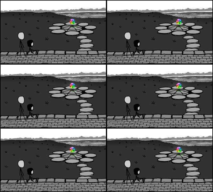
XKCD's tribute:

Wednesday, September 21, 2011

Inconsistent Interfaces

Apple, which is usually the master of great interfaces, pulled some weird things in the recent upgrade to OSX. The Calendar app lost its metallic look and feel (and I don't like it and it's not consistent with everything else). The Contacts app lost the great letter-tabs that let you jump to a letter (this feature is still present in the iPhone version).

But in Mail they did something I don't understand and have only noticed recently (so I assume it was not like this previously). If you make a new message, some of the buttons (like for attachments) are on the left, whereas if you reply some of those same buttons are on the right. I do a fair amount of attaching, and this is highly annoying since I cannot make a work habit, I have to actively think about it each time.


Here is a reply. Only the Send button is on the left, Attach is on the right.


Here is, as you can see, a new message. Attach is now on the left.


Given there is little difference between a new message and a reply, I cannot see that there is any reason to move the buttons around. (Everything is about design.)

Edit: I remade the images so they fit better. The image/textwrap is killing me, though.

Wednesday, November 10, 2010

Design Options

I want to talk about two designed items, the choices behind them, and the resulting ease of use: an alarm clock and a recycling can.

I have a Brookstone alarm clock, with a long-life battery so it will always (or, for longer than the rest of it will last) remember the time, like magic (that's the idea). As a user feature, they built into it the time change for daylight savings. Which is nice, since I don't have to ever change the time, it does it automatically, like my phone and my computer. Except I do have to do it, four times a year, since the US Congress changed when we change the time.

The problem is it's hard coded, and not at all flexible, and the information that is hard coded into it (what date the time change happens) did indeed flex, but the device can't. So, zero was better than two (zero changes if the clock changes the time, twice if I change the time). But now it's four, and if zero is better than two then we know four is pretty terrible.


(To be clear, it's four because it changes earlier than it now should, so I have to change it back, then it doesn't change when it's supposed to, so I have to change it again, and do this the two times a year we change the clocks. And this only works if I live in part of the US where we change the time.)

Automatic time change? Good usability decision. Hard wired? Not good.

The other item, a recycling can, I saw the other day at one of the artsy theaters on Houston street here in NYC. One problem with a lot of public-area recycling cans is that people are busy and their attention is elsewhere and they throw out trash in recycling cans, which makes it look like a trash can and more people do it. But this design had a little lid with the recycling logo on it, and you had to lift the lid, which meant you had to look at it and think, "How do I open this, aha a handle, oh look a recycling logo." It forced you to slow down a second, and think, but only a very small, easy amount.

Granted these are two different areas of design, but they both remind us of the importance of design, and how little things can make a big difference. Also, flexible systems.

Friday, October 1, 2010

Community and Dwarf Fortress

I haven't posted much lately, besides working on the book I've been playing studying the game Dwarf Fortress (available for Windows, OSX, and Linux) and the culture of its fans. It is a difficult game for at least two reasons: One, it is a difficult game (you have to micromanage a ton of stuff, more as you grow your fortress), and two, the interface is brutal. And there is no winning the game. There is no win condition. There is only eventual death for your Dwarves.


The game, without an added tileset, is all in ASCII. No, not text, ASCII. So yes it looks like text, but it's not words. The 2D world is presented in ASCII (but it's a 3D world, you scroll up and down through levels). That E over there? An elephant. T? That's a troll. O? A giant Olm. Lowercase c? A small cat, aka a kitten. But not everything is letters. I use a tileset, since I found the original flavor of DF absolutely impossible, especially when combined with the difficulty of the game for newbies. (So actually those letters are the ones I get in the tileset, they may or may not be the ones in the un-tilesetted game interface.) Here are some screenshots at Bay 12.

Try reading this review, which says, "nothing about it is simple. Dwarf Fortress is immense, hugely complicated, insanely detailed, and uses only ASCII characters for graphics." And more!

But this does not stop the fanbase. In fact, given that people often emotionally buy into something stronger if they had to put more effort into it, we can see why this might be so (and is for some, if you can get over the learning curve, which is really more like a learning cliff it is so steep). Here is a simplified flowchart of the game. Keep in mind some DF fan made that flowchart.

But we see a lot of things that people do with other stuff are the things people are doing with Dwarf Fortress.

Fans made a wiki, and have updated it across major version changes. (You will want it open whenever you play.)

Fans made tutorials, since the game is impossible without them. (Here's one, and here is the wiki page with several.)

Fans have modded the game with tilesets (again, impossible without, except for the real die-hards). Here's one that is pretty amazing. Here's a page with links to mods and tilesets.

Fans have made DF art and stories based on gameplay. (Well worth a look, great art style, and funny, note the grim humor.)

Fans start up a new game, and then hand it off to someone else, to let them run the fortress, and they write it up. (This is for an older version of DF, which I think had just one level. Note the grim humor.) (To use and paraphrase Sony's and MM's LittleBigPlanet tagline, which I use all the time, they played, they created, they shared.)

There are of course forums, where players help out by answering other players' questions (so I learned that flux needs to be on the same level as your smelter and forge or it won't be available, it's bugged and was driving me crazy).

It's fun. (I didn't link that for no good reason, by the way. Note the grim humor.)

But the fun (as defined above in that link) is pretty amazing, and relates to the absolutely grim sense of humor that most DF players exhibit when writing about DF online.

Here's a line from a current (may change!) wiki entry: "It is unknown whether this is a bug or a feature."

From the Bronzemurder saga that you should have read (really):"I play Dwarf Fortress. Sometimes I wish I was a meth addict instead."

There seem to be a lot of stories of accidental floods. Elephants. Elves. Forgotten beasts. Dwarves falling down wells (apparently they do that). Dying of thirst during winter if you have no water source (oops!). On occasion they kill each other. "Things of that nature" where "things of that nature" include pretty much anything.

There are many other examples that I've seen, and that you can find online. I won't say "I will try to post them" since if I never do then it will be one of those never-corrected online sentences, posted and forgotten.

Edit: A Master's thesis on Dwarf Fortress? Why yes, the MIT Comparative Media people have been there and done that.

Wednesday, September 1, 2010

Touch is not a Natural Interface

There is a rather dismal article over at the New York Times, To Win Over Users, Gadgets Have to Be Touchable, by Claire Cain Miller. (I think my expectations are too high for the NYT, but that's another story.) The main idea of the story is that the current touch interfaces (thank you, Apple) are "natural" and we don't need to learn them, we know them already.

Unlike past interfaces centered on the keyboard and mouse, natural user interface uses ingrained human movements that do not have to be learned.
But this is not at all true. A lot of the things we do with touchscreens are the exact same things, conceptually, that we've been doing with GUI interfaces since 1984 (GUI, for those of you who have forgotten, stands for Graphical User Interface, meaning, a mouse, windows, file icons, folders, probably a desktop, in other words, not the text-only CLI, which is Command Line Interface).

If you want an app to launch on your iPhone, you touch it.

If you want an app to launch on your Mac, you touch it with your mouse, which is your onscreen finger. Technically you mouse over it and double-click it, but, it's the same concept. Your mouse cursor is always in the screen, your finger spends most of its time not physically touching your touch-device screen. Same thing.

I could go on, but let's look at text. If you want to select text on your iPhone, you hold your finger on it and expand or select the amount of text you want. If you want to select text on your Mac, you have to take similar direct action on the text with the mouse cursor, which may involve clicking (perhaps with the shift key) or click-dragging or double-clicking.

It is, again, the same basic concept.

In some ways, it is not "ingrained." Widespread literacy is a historically recent phenomenon, but I doubt the ancient Romans poked their finger at text on a scroll and expected anything to happen.

In other ways, it is ingrained, because by copying the concepts from desktop, GUI-based, operating systems, touch-screens were copying a computer front-end that tried to mimic our human interface with our real-world offices: files, folders, trash cans, and a desk (desktop). If you want to do an action on an item, you poke it with your mouse cursor.

I've seen many a touch-device running Windows, where the mouse cursor follows your finger. I cannot remember what these devices are, they may be airport check-in kiosks. (I am pretty sure some were.) Your finger is the mouse.

Of course if you have an iPad or iPhone and there are no buttons on it, well, what's left to try? Touch.

I am reminded of a scene in one of the Star Trek films (the one with the whales, and Chekov's famous line about "nuclear wessels"). Scotty sits down in front of a classic form factor Mac, and tries to talk to it like he would his futuristic computer. The current-day assistant looks confused, and then hands Scotty the mouse, saying "Try this." Scotty picks it up and tries to use it like a microphone. (Eventually he gives up and uses the keyboard, which isn't a realistic approach to what he ends up doing, but that's besides the point.)

Natural interfaces are learned. (We spend many years learning how to interact and interface with the real world and especially people.) They may be easy, but they are learned.

Saturday, August 14, 2010

Play and Buttons and Fingers

I was reading a New Yorker article, "Painkiller Deathstreak: Adventures in Video Games", by Nicholson Baker in the August 9th, 2010, issue, and, concerning the "seventeen possible points of contact" for his fingers and the Xbox 360 controller that he may need to consider to play a game and do one of the many actions he lists (like run, crouch, aim, fire, pause, leap, speak, stab, grab, kick--actually I think he lists 17), he writes...

It's a little like playing 'Blue Rondo a la Turk' on the clarinet, then switching to the tenor sax, then the oboe, then back to the clarinet.
So, yes, crazy mad finger positioning that you had better know ahead of time, like I was talking about previously.

Tuesday, July 27, 2010

Guitar vs. Guitar Hero

I was pointed out to me by my brother that playing the guitar is a lot like playing a video game: There are certain things you need to do with your fingers at certain times, and you need to memorize the moves (either specifically or generally) before you try it so it works out better.


He's right.

Having played electronic games for over two and a half decades, and finally poking about working on the ukulele, it's entirely true. It isn't true for all types of all computer games, but for example with games on the Xbox 360 or the PS3, you need to know which buttons and triggers to mash when. Some games on computers are finger-twiddlers (mash buttons!). But usually not just any buttons, the right ones at the right times. Which means, your fingers have to be in the right place at the right time, just like fingering for chords on a guitar or other stringed instrument (bass, banjo, ukulele, upright, violin, etc.).

I can see a future where the current Guitar Hero and Rock Band guitar necks don't just have five buttons and a few other controls on the body (see Rock Band guitar info), they have some larger amount depending on the complexity of the device. A ukulele has four strings, so four across by however many you want down the neck. Basses usually have four (although I have a bass with five). Guitars typically have six strings, so six buttons across by the number you have coming down the neck. A great deal more buttons, but the idea and the skills are exactly the same. Where are my fingers positioned, and when? In the TV show Californication, the young daughter plays guitar and also Guitar Hero. Can Guitar Hero be a lead-in to guitar playing? I'm not sure if it is, but it could be.

[Addition]
Here's a good point by my friend Dr. Matthew Bietz. I totally forgot to think about the next step, of production versus consumption. In guitar games, we are consumers, and copy (to some extent) the music. With a real guitar, you make your own music, or make riffs on things, or play things slightly differently and that can be a good thing. Production is much more powerful, on an important, fundamental human level.

The tagline for LittleBigPlanet by Sony and Media Molecule is Play. Create. Share., and when we play music together, that is what we are doing. Playing, creating, and sharing are all community building and community reinforcing activities, and since we are driven to connect, they are all important. Playing a guitar game, there is play, but there is no create and share.
[End Addition]

Ukulele... You may not have much love for the ukulele, but here are some things that may help you down the path.

Walk Don't Run by amazing little Japanese crocheted guys.


While My Guitar Gently Weeps covered by Jake Shimabukuo (who has his own YouTube channel). Over 5.5 million views. He goes nuts at 2:40, although there are hints of what is to come earlier and you should watch the entire video anyway. Amazing.


Here he is, at 1:10 he demonstrates the range of the ukulele. And he's at TED. Most of you have not been invited to TED. TED? Very cool. TED = ukulele.