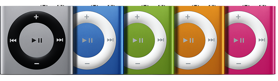
Although it isn't meant to (primarily) present the evolution of the physical design of the iPod over the years, Apple's "Identify Your iPod Model" page is a really nice visual presentation of the physical interface--where are the buttons?, what do they do?
Wednesday, November 30, 2022
Evolution of iPod Design
Thursday, April 14, 2016
For A Decent CSV Spreadsheet App
All I want is a decent spreadsheet app that does not insist on mangling my CSV files, which often have ID numbers in them which I might want to view as text and not numbers. Apple's Numbers is maddening (you have to export to CSV, extra steps, and it has a relatively low row limit, 65,535 I believe) and Microsoft's Excel is a little better but I'll use it as an example here of What You See Is Not What You Get.
I am doing some work on cities and (county-level) FIPS codes (so, in the US, FIPS codes are Federal level identifiers useful for a lot of things, they identify counties). Some cities are large and lie in more than one county. Some of the data I have deals with cities, and the income data is on the county level, so I need to map from cities to county FIPS.
Excel did not make this easy.
The file I grabbed off the net to help me map cities to FIPS (counties) quite correctly listed all the appropriate FIPS codes for each city. I needed to narrow this down to one (Wikipedia helped a lot, the geopolitical Wikipedians are nitpickers).
FIPS codes for counties have two parts, two leading digits for the state and then three digits for the county. So all FIPS codes that start with 36, for instance, are counties in New York state.
The format from my source file looked like this:
Raleigh, NC: 37063,183 Birmingham, AL: 01073,117 New York, NY: 36005,047,061,081,085(I am pretty sure those 5 numbers for NYC are the 5 boroughs, I know Brooklyn is its own county, Kings county.)
Excel, however, would show the following in the main view, interpreting these IDs as numbers--errors are in the parentheses, A, B, and C:
Raleigh, NC: 37,063,183 (A) Birmingham, AL: 1,073,117 (A,B) New York, NY: 36,005,047,061,081,000 (A,C)
- Added a comma that isn't there.
- Dropped leading zero.
- Rounded rightside digits.
That was all extremely infuriating, and reminded me of Microsoft's Clippy, where the coders thought they always knew better than you. Granted, a lot of apps and even programming language packages try to be smart and guess formats, and yes this can be useful. But if there are leading zeros and commas in odd places (or not) and it's a CSV (text) file, there could be a default "read CSV as text". Of course it seems that neither of these two programs have been coded to play nice with CSV files.
As such, they are not overly useful data science tools.
Friday, October 2, 2015
Fixing Gephi on Your Mac
TL;DR: Download JDK 1.6, then point a Gephi startup file to it maybe with one change (/Library... and not /System/Library...).
UPDATE: New Gephi is out!
Original post continues below.
The longer version is that Gephi, which I love, hasn't had an update (as of this writing) in quite some time (parts of it have, parts haven't) and it doesn't work with the newer versions of Java. The 0.9 version download file for OS X doesn't seem to be where the link says it should be (again, as of this writing in early October, 2015).
Apparently Gephi 0.8 needs Java version 6, not version 7 or 8. Java appears to have lots of parts, names, and maybe even v6 is "1.6" and v7 is "1.7" which I don't understand but I don't do Java so I'm not going to spend time figuring it out--I got Gephi to work, that was all I cared about right now.
My new laptop, to replace my five-year old one, didn't even have Java on it (ah, the purity of it all). I got the JDK (Java Developer's Kit) 1.6 from part of the Apple Support website, which is what you want.
But you have to tell Gephi about it, as far as I know. This article was awesome except it turned out on my machine not quite right (but close enough that I figured it out). Java wasn't where I thought it would be. This article on Stackoverflow helped me find Java 1.6, although note the article is about Java 1.7, so make the command this:
/usr/libexec/java_home -v 1.6
(Ok now you don't need to read the Stackoverflow page, just run that in your terminal if you've installed 1.6 and don't know where it is.)
Turns out, I don't know why (and I don't care, it's working) Java 1.6 wasn't in /System/Library... it was instead in the same path but not the one in /System, it was just in /Library....
/Library/Java/JavaVirtualMachines/1.6.0.jdk/Contents/Home
So, put that line in the Gephi startup file near the top as per the directions (I made it the first command) and so far Gephi actually loads, which it wasn't doing before. Granted I haven't actually tried to do anything with it, and who knows if this will blow up other Java things (or maybe my machine really didn't have any Java on it at all).
Tuesday, January 20, 2015
Apple's Audio Outputs and #Fail
If you want to stream sound on your Mac to your stereo jack speakers by the computer and to your Apple Airport Express with its audio, you can't if your sound stream isn't through iTunes and is, say, via the web (like with Pandora in my case). Not at the same time, regardless of what the web says. The stereo jack output doesn't work that way, apparently. (This does work quite well if your sound source is iTunes, note.)
A lot of sites say you can do this generally, and have detailed explanations about how you make a new device through the Audio Midi Setup app. An article at MacWorld hints at the problem but isn't at all clear: "Let’s say you have an Airplay device plus a USB, ethernet, or Firewire audio interface attached to your Mac..." Right. Note the article doesn't mention the stereo out port (the one that matches your little headphones on your iPhone, Android, or oldschool Walkman), because it won't work.
The best I got was stereo on my Mac and one horribly noisy speaker on the Airport Express (through a receiver). The easy solution, although I haven't actually tried it, is to use one of the other sound outs on the Mac (probably the monitor over Firewire) instead of the speakers, but I like my speakers here. The other, better and more expensive solution, is to go with Sonos -- a friend of mine has some Sonos devices and it is an awesome setup, very easy to use and understand, streams from lots of sources, and the app on the iPhone seems great to me.
Update: You can make an "aggregate" device or a "multi-output" device, and neither works for me at all. When I tried using the Airport and the Firewire monitor speakers, which seemed like it should work via all the online help, it didn't -- the best I got was one of the two speakers on the receiver via the Airport (both of which work fine through iTunes or System Preferences when the Airport is the only sound out device) and the monitor speakers had a large amount of noise (a hiss, to be specific). This is unbelievable. Apple is usually really good about making simple things easy, but not here. Weird given how great NeXT hardware and software were at sound.
Update 2: I FOUND A SOLUTION! Via TidBITS, the little app Airfoil from Rogue Amoeba! It works! And it's only $29.00 as I am typing. Really OSX should just do this, but it doesn't, and $29 for a solution that does a lot more than what I am trying to do currently (that is, it gives me future flexibility) is great.
Wednesday, June 25, 2014
The Real Problem with the iPhone Fingerprint Sensor
It gets shmutzy and won't read your fingerprint until you clean it. This might involve pressing it hard enough to activate Siri. This is not a bad problem to have, "boo hoo I have a smart phone my life sucks."
When it came out, there were far too many breathless articles about how someone could make a rubber copy of your fingerprint and then hack your phone. This was stupid, and everyone knew it was stupid, but people wrote about it anyways. (And apparently a lot of people don't even have passwords at all on their phones, so....) In order to do this, you'd need to steal their phone and make a rubber copy of their fingerprint. How many times has this happened? Zero. Why? Because the internets would blow up if it did, and that hasn't happened.
![]() |
| (Photo credit Apple Inc.) |
Monday, October 21, 2013
iTunes Radio
Still working out a few kinks, as you can see (not repeating recently played songs). The result is I have had Fiona Apple stuck in my head for four days. (Not 'shopped.)
Monday, September 23, 2013
iPhones and Finger Prints
What all of these excitable "we can copy fingerprints!", "fingerprints make horrible security!" posts miss is the really awesome thing about fingerprints versus a security code on your phone: Your 9 year old will try really, really hard to see what your code is (as will your 8 year old, your 7 year old, your 6 year old, your 10 year old, and so forth), but kids cannot copy your fingerprint and make a usable replica to get into your phone--unless you have trained your kid to be that amazing, and then not only do you have other things to focus on besides your kid making fake fingers but your kid probably has his or her own device and doesn't want yours.
Edit: And, c/o Daring Fireball, about 50% of people don't even have passcode security enabled on their phones.
Friday, July 19, 2013
My Next Computer
I don't have amazing Gimp skills, but hey here's my (pun intended) next computer...
(Orig image is one of the currently soon to be new Mac Pros, and of course, its new logo.)
Sunday, June 24, 2012
Microsoft's Approach?
From a current NYTimes article by Nick Wingfield about Microsoft:
The [Microsoft] executives were stunned by how deeply Apple was willing to reach into the global supply chain to secure innovative materials for the iPad...I read that as, "Microsoft executives don't give a damn about quality or innovation." However, neither quality nor innovation have ever been Microsoft hallmarks. Zune?
And, later in the article:
In a nod to Apple’s work with aluminum, Microsoft began to closely study materials that could be used to create a distinctive case for a tablet. Members of the Windows team gravitated toward magnesium...Except of course, Steve Jobs knew about magnesium. I owned a Jobsian computer made of magnesium for some time: a NeXT cube.
Wednesday, April 4, 2012
Disappointing Analysis from Pogue
Usually, I like David Pogue's posts on technology, as he has a bit of humor and humanity that some other reviewers lack. But today Pogue lacks decent analysis in a review of the Lumia 900 phone. His presentation of pricing and screen resolution do not meet the basic standards of reporting. Recall I used to work at Ziff-Davis many years ago, where we did computer reviews.
Pogue:
It’s the Lumia 900. It’s beautiful, fast and powerful, and it’s only $100 (with a two-year AT&T contract). That’s half the price of an iPhone or a comparable Android phone — but you’re still getting a top-of-the-line machine.The problem is that it is not at all half the price, thus his mention of the two-year contract, but that's a weak analysis and not at all true. Granted, different calling plans cost different amounts, but let's look at some hypothesized numbers. Let's call the cost of the phone the "up front" cost, since that's more accurate.
| Phone | "Monthly" | Up-Front | Annual | Total |
| Lumia 900 | $50 | $100 | $600 | $700 |
| iPhone 4S | $50 | $200 | $600 | $800 |
| Compared | 50% | 87.5% |
87.5%, for this theorized monthly, is not half.
But many calling plans cost more. What if the theorized monthly were $100?
| Phone | "Monthly" | Up-Front | Annual | Total |
| Lumia 900 | $100 | $100 | $1,200 | $1,300 |
| iPhone 4S | $100 | $200 | $1,200 | $1,400 |
| Compared | 50% | 92.8% |
92.8% is not half.
(And, you can get the iPhone 4 currently for $100, and the 3GS is free -- of course, like Pogue mentions but doesn't deal with, that's with a contract. Given that you can't divide by zero, the 3GS is unspeakably amazing.)
But that's not the only problem with Pogue's analysis.
Then again, the Lumia actually shows you a larger area, but in less detail. Its resolution is 800 by 480. The iPhone’s 3.5-incher has 960 by 640 pixels, so Apple’s screen is far sharper.The Lumia 900 has a 4.3 inch (diagonal) screen. The problem is that Pogue gives us two sets of metrics: resolution and size; but these are not directly comparable. Resolutions are comparable, but only at the same size. We don't have the same size, so Pogue should tell us the dpi -- dots per inch (in this case, pixels). You can't exactly calculate the dpi from these numbers, because the diagonal measure does not give you the area in terms of square inches, so you can't calculate the pixels per (square) inch.
So, yes, the iPhone 4S has more pixels, but not 960x640 versus 800x480 more, because the screen sizes (not just resolutions) are different. Pogue addresses this, but not at all adequately.
Friday, October 28, 2011
"I Told You So"
About five years ago I told a major market research firm the following:
Currently the Zune is too problematic to be part of the digital near-future.
I said that Microsoft had to "fix it." I don't think the market research firm liked that I said that, since they blew me off after that. Something happened earlier this month that was so barely noted I missed it until earlier this week: Microsoft cancelled the Zune. It is actually difficult for me to find a news outlet that I am used to using which reported it (but there is always Wikipedia).
I could say that it feels good to be right, but I've been right the entire last five years and I've always known it. As for the market research firm in question, well, they don't know what they are doing.
Saturday, October 8, 2011
Steve Jobs and Design
Design is really an important part of the Steve Jobs story, and it isn't one that a lot of people understand. Some do. So, although it isn't an understanding that comes quickly or easily--it's more like riding a bicycle, you have to learn it by doing and falling over sometimes--it is one worth understanding.
So, here's a NYTimes article on Jobs and design, and here's the text of Jobs' Standford address from 2005, where he discusses calligraphy, and lastly here is one about Jobs and what is not there in terms of design, called ma, or what is not there, which I think is a vital part of the picture (the author of that article, Jeff Yang, explains it well).
Everything is design, design is everything.
Thursday, October 6, 2011
Steve Jobs, 1955 - 2011
I only saw Steve Jobs once, since I didn't live in the right places or do the right things to meet with him or see him at a Keynote. I saw him at the NeXT building, in 1993 or so, and he was running a meeting. I remember the building had a cool glass staircase in the middle, just like many Apple stores do today. So I don't have any stories about Steve Jobs, but I do have a story about the Macintosh, interfaces, and understanding the Mac, because Steve got it, and a lot of other people didn't.
Freshman year I got my first Mac, a Mac Plus. Previously we'd had a family Apple IIc, which was awesome. The Mac was so different at first I didn't even really know how to use it. One following year, perhaps sophomore year, as a computer room TA I attended a meeting where the new student computer lab was announced, or something like that. This wasn't the computer science computer lab, but the one where students would all write papers (amusing, there used to be computer labs where the only things students did on computers was write papers). The person in charge announced that the only computers in the lab would be brand-new IBM PS/2 (somewhat strangely, Sony would later use the same name, at least as spoken, for their second Playstation, but really almost no one remembers IBM's little odd computer line).
I knew this was a horrible decision, so much so that I had a look of shock on my face. I probably would have forgotten this entire event, except the computer person looked at me and said, "You're a Mac person, aren't you?" somewhat smugly.
The problem was Macs cost more -- in the immediate, this financial quarter, short term view.
But what I knew was that the GUI that Apple had started to make viable was the future, and needed to be the present, and that the DOS-based world of IBM and Microsoft was on its way out.
Instead of a GUI, which is vital for word processing -- think of formatting like centering, italics, and bold, all the things that students do in papers -- we got... some hackneyed CLI and a word processing program with an almost unusable interface. This means the TAs were always busy answering the same formatting questions, and students wasted thousands of minutes sitting there trying to figure out the command for italics or save.
There was no mouse (actually, there might have been, but a mouse without a GUI is somewhat stupid). There were no menus. What you saw had nothing to do with what you got. I don't remember exactly, but text in italics was probably highlighted a little. Text in bold, perhaps moreso. To find any command, instead of using an easy menu-system, there was the horrible set of function keys. If you're old enough you'll remember those horrible plastic templates that you had to put over the function keys to see how to get any command you needed. F4 did something, shift-F4 something else, ctrl-F4 a third thing... Probably alt-F4 and maybe even alt-shift... An entire massive template, with tiny text and absolutely no order to the commands at all.
The computer lab was horrible for both students and TAs. The college's computer buyer had no idea about computers, she only knew about the bottom line for that term. I knew what it should be, because Steve had showed me: he a vision, he pushed for it, and made it happen.
Later, I had a NeXT cube for a while. Even with an 040 processor (after-market) and only four colors (black, white, and 2 greys), there was a great ease and simplicity to the design of the GUI. Not a simplicity of poverty, but one that gave you everything. I think this is what people are talking about when they talk about how Steve Jobs knew to focus on what to take away, and what wasn't there.
XKCD's tribute:
Wednesday, September 21, 2011
Inconsistent Interfaces
Apple, which is usually the master of great interfaces, pulled some weird things in the recent upgrade to OSX. The Calendar app lost its metallic look and feel (and I don't like it and it's not consistent with everything else). The Contacts app lost the great letter-tabs that let you jump to a letter (this feature is still present in the iPhone version).
But in Mail they did something I don't understand and have only noticed recently (so I assume it was not like this previously). If you make a new message, some of the buttons (like for attachments) are on the left, whereas if you reply some of those same buttons are on the right. I do a fair amount of attaching, and this is highly annoying since I cannot make a work habit, I have to actively think about it each time.
Here is a reply. Only the Send button is on the left, Attach is on the right.

Here is, as you can see, a new message. Attach is now on the left.
Given there is little difference between a new message and a reply, I cannot see that there is any reason to move the buttons around. (Everything is about design.)
Edit: I remade the images so they fit better. The image/textwrap is killing me, though.
Monday, January 10, 2011
If You Follow, You Will Never Lead: Microsoft's Business Non-Strategy
The title of this post comes from my years growing up as a sailor in Nantucket, Massachusetts, on the wall of the old sail room in the Nantucket Yacht Club. The idea was that you'll get the same wind as the boat ahead of you, and, unless you are a greatly better sailor or have a vastly better boat, you will never overtake the leading boat. If you were that great, you probably wouldn't be behind in the first place.
This is not completely true in business, despite the myth of "first mover advantage", which is only true for successful products (so, not true in the long-term for Palm, nor for Apple's Newton, nor Atari in video games, to name a few). If you can copy products but improve on them without getting sued for patent violation, that may be viable, albeit difficult, and, honestly, foolish.
But it is Microsoft's strategy. I'll have to point out ahead of time that although they are ahead in market share in terms of operating systems if you group all the different versions of Windows, they are not ahead in some equally valid areas of measurement, such as smart phones (iPhone versus Windows Phone -- and they're not phones, of course, they're minis, as in, mini computers), digital music devices (iPod versus Zune), and, another measure, market capitalization -- Apple closed at an all-time high on Monday ($342.45), for a market cap of $314 billion, second only to Exxon Mobile in American companies. (The most recent number I can get for Microsoft's market cap is $240.5 billion. Not bad, but less than $314 billion, clearly.)
I would include digital music sales, but I don't actually think Microsoft really does that in any workable manner (iTunes Music Store versus what?). I'll have to check. I guess I could mention PlaysForSure. Oh I guess it's Zune Marketplace, which seems like a copy of... the iTunes Music Store. Well that continues to back my point. (I'll place it in the table below.)
The point is, Microsoft loves to copy, or on occasion purchase outright, what others are doing. And they usually do it badly, in terms of design and usability, despite market success over the long term, so far. Let's look at some examples.
| Microsoft | Bought/Copied |
| Bing | Copied Google (see note) |
| DOS | Licensed another form of DOS (86-DOS) |
| Halo | Bought Bungie, for the Xbox |
| Hotmail | Bought, not as good as Gmail |
| Windows | Copied Apple's Mac OS |
| Windows Phone | Copied Apple's iOS and iPhone for the most part |
| Xbox | Copied Sony to challenge the PS platform |
| Zune | Copied Apple's iPod |
| Zune Marketplace | Copied Apple's iTunes Music Store |
(I corrected/clarified the copying/licensing for DOS, I didn't like my initial explanation and it turned out not to be very accurate.)
The point is, Microsoft does not lead, it follows. I admit one interpretation is that I am saying that first-mover, which I just derided in a previous paragraph, is a strong effect, but that is not what I am saying. What I am saying is that Microsoft does not innovate, nor does it really micro-innovate, copying a product and then improving it as much as they can (incrementally). They buy products when they can't make a good competitor, and they copy products and they still can't make a good competitor (Apple's OSes have always been better, don't compare market share unproblematically since you have to deal with the hardware side of the equation, where Microsoft was not making the computers).
Apple tends to make products (and services) that make new markets (or, do so successfully). They are, to some extent, based on pre-existing forms, but not ones that are market successes.
| Category | Apple's Move |
| Digital Music Downloads | iTunes Music Store (paid, not early free Napster) |
| Digital Music Player | iPod (a digital Sony Walkman) |
| GUI OS/Mouse | Original Mac OS (from work at Xerox PARC) |
| Smart Phone | iPhone (a mini computer, really) |
| Unix | OSX (based on NeXTSTEP, from Unix) |
I'm avoiding the iPad as I think we need to wait another year to see how the "tablet" market pans out in the initial phase of the iPad era. Like NFL football before Thanksgiving, it's just too soon to tell. Apple's iPad has generated the most media coverage of recent tablets, which could be an honest indicator of quality, but I think there is some effect from journalists (not incorrectly) thinking they need to cover the iPad. There are probably some other items I could place in the list, but those are the most defensible and explainable that I can think of. (So, I'm avoiding USB and floppy disks.)
As I pointed out, it could be argued that none of these were new products either, but the thing is that, unlike with the Microsoft examples, none of these Apple products went up against anything similar that was successful in the market. (RIM's Blackberry series of phones, although cool, were still in the interface and paradigm of cool handheld phone devices, like Palm to some extent, the iPhone is a different device, it is not really a phone in the full sense, it is a computer that also has phone capability -- did you ever call your desktop computer a phone when it had a modem?) OSX didn't face a mass market Unix, Unix is mainly in labs, corporate back offices, and the homes of Linux geeks. (I've had... two? At least two, Linux boxes, so far.) There was an MP3 player before the iPod (I can't recall the name offhand), but it was not widely successful. Apple made a better interface (the wheel, which has now been replaced with touch screens for the most part).
This is also not to say that everything Apple does is gold (the Newton didn't succeed in the market, Apple's computer offerings were overpriced, underpowered, and muddled in the early 1990s, and there have been occasional but odd AppleTV offerings--usually a Mac with a TV tuner card--which seem to have worked themselves out finally), nor that Microsoft isn't a market success (despite, or perhaps because of, monopolistic practices, and who can resist taking a shot at Microsoft's Bob?).
Leading, and innovating, versus following. As others have pointed out, innovation is risky, but not innovating is moreso.
Note: When I said Bing was "copying" Google, I didn't mean literally copying the search results, I just meant the idea. Apparently, according to this report, Bing is indeed directly copying Google search results. Amazing.
Saturday, December 4, 2010
Names and History
A nice point by Paul Graham about what we call touchscreen devices like iPhones, which I saw on boingboing (I thought, but can't find it, maybe not) and Daring Fireball:
The only reason we even consider calling them “mobile devices” is that the iPhone preceded the iPad. If the iPad had come first, we wouldn’t think of the iPhone as a phone; we’d think of it as a tablet small enough to hold up to your ear.This is standard human behavior, we've done it before. We present new things in terms of the more-familiar then-current things. Horses led to horseless carriages, from which we dropped the "horseless" and "-riage" part of carriage to get just car (I believe), which we still drive. There was also the iron horse (the locomotive), and the wireless telegraph (early radio before voice was used).
Monday, October 25, 2010
Apple, Handhelds, and Disruption in Markets
Every time I see an advertisement for a touch phone, smart phone, or whatever you call them, I can only think of how Apple created this working technological system and the market. Really they are touch-screen handheld computers, but they come marketed like phones, so we call them phones and think of them like phones--computers had modems built in, at one point, and we could actually make phone calls on them, but no one ever referred to a computer as a phone.
Friday, July 23, 2010
Flawed Comparisons
Some comparisons really don't work, but are presented as if they are spot-on. Here's one from CNN's "Smartest People in Tech" that I found amusing, from #2 CEO Jeff Bezos' writeup (which comes after #1 CEO, Steve Jobs).
...virtually every iPad review compares Steve Jobs' tablet to Bezos' device.
Saturday, July 17, 2010
iPhone 4 Antenna Issues, Explained
The first thorough, understandable, and yet technological explanation of the iPhone 4 antenna issue that I have seen is over at TidBITS, an article by Rich Mogull. Well worth several minutes of your time.
Thursday, May 6, 2010
The iPhone and Multitasking
One often-mentioned criticism of the iPhone, despite how the device and the information infrastructure in which it exists forced all the primary mobile carriers and manufacturers to produce and support touch-phones that are handheld computers/communication devices, is how it does not multitask.